This post is a brief example of how AI tools such as GPT-4o or Claude can accelerate your programming.
A Zero Shot Example
Our example in class was this prompt:
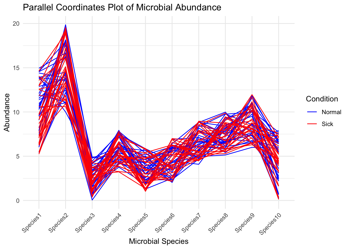
I want to use the tidyverse to create a parralel axis plot of microbiome data. I have 10 microbial species that will be the axes and a want to plot the abundance for 58 different samples. the samples are equally divided between normal baby poop and baby poop from sick babies.
I put that prompt into AnythingLLM (pointed at the OpenAI API) and after a brief interaction:
Ada says you suck because of this error Error in [.data.frame(data, , columns) : undefined columns selected
We got this response and this code:
The error you’re encountering is due to the columns argument in ggparcoord, which specifies the numeric indices of the columns to be plotted. We need to adjust those indices based on the actual column positions in your dataset. Let’s refine the code.
Make sure the column indices in the columns argument match the positions of your microbial species in the dataset and that groupColumn correctly refers to the column with the grouping variable (Condition).
Here’s the corrected code:
Code
# Load necessary librarieslibrary(tidyverse)
── Attaching core tidyverse packages ──────────────────────── tidyverse 2.0.0 ──
✔ dplyr     1.1.4     ✔ readr     2.1.5
✔ forcats   1.0.0     ✔ stringr   1.5.1
✔ ggplot2   3.5.1     ✔ tibble    3.2.1
✔ lubridate 1.9.4     ✔ tidyr     1.3.1
✔ purrr     1.0.4
── Conflicts ────────────────────────────────────────── tidyverse_conflicts() ──
✖ dplyr::filter() masks stats::filter()
✖ dplyr::lag()    masks stats::lag()
ℹ Use the conflicted package (<http://conflicted.r-lib.org/>) to force all conflicts to become errors
Code
library(GGally)
Registered S3 method overwritten by 'GGally':
  method from
  +.gg   ggplot2
Code
# Example microbiome data, replace this with your actual datasetset.seed(123) # For reproducibilitydata <-tibble(SampleID =1:58,Condition =rep(c("Normal", "Sick"), each =29),Species1 =runif(58, 5, 15),Species2 =runif(58, 10, 20),Species3 =runif(58, 0, 5),Species4 =runif(58, 3, 8),Species5 =runif(58, 1, 6),Species6 =runif(58, 2, 7),Species7 =runif(58, 4, 9),Species8 =runif(58, 5, 10),Species9 =runif(58, 6, 12),Species10 =runif(58, 0, 8))# Create parallel coordinates plotggparcoord(data, columns =3:12, groupColumn =2, scale ="globalminmax") +labs(title ="Parallel Coordinates Plot of Microbial Abundance",x ="Microbial Species",y ="Abundance") +theme_minimal() +scale_color_manual(values =c("Normal"="blue", "Sick"="red")) +theme(axis.text.x =element_text(angle =45, hjust =1))
In this code, the columns argument is set to 3:12 to refer to the species columns, assuming these are from the 3rd to the 12th columns in your dataset. Adjust these indices if your data structure differs. The groupColumn is set to 2, assuming the Condition column is the second column. Please ensure your actual dataset aligns with these assumptions.
What About Python?
Then we decided to change programming languages entirely!
I’ve changed my mind. I want to use Python instead.
I’ll spare you the brief iterations, but we ended up with this:
Code
import pandas as pdimport numpy as npimport plotly.express as pximport plotly.graph_objects as go# Example microbiome datanp.random.seed(123) # For reproducibilitydata = pd.DataFrame({'SampleID': range(1, 59),'Condition': ['Normal'] *29+ ['Sick'] *29,'Species1': np.random.uniform(5, 15, 58),'Species2': np.random.uniform(10, 20, 58),'Species3': np.random.uniform(0, 5, 58),'Species4': np.random.uniform(3, 8, 58),'Species5': np.random.uniform(1, 6, 58),'Species6': np.random.uniform(2, 7, 58),'Species7': np.random.uniform(4, 9, 58),'Species8': np.random.uniform(5, 10, 58),'Species9': np.random.uniform(6, 12, 58),'Species10': np.random.uniform(0, 8, 58)})# Define colors for each conditioncolor_map = {'Normal': 'rgba(0, 0, 255, 0.3)', 'Sick': 'rgba(255, 0, 0, 0.3)'}colors = [color_map[condition] for condition in data['Condition']]# Get the column names for speciesspecies_cols = [col for col in data.columns if col.startswith('Species')]# Create the parallel coordinates plot using graph_objectsdimensions = [dict(range=[data[col].min(), data[col].max()], label=f'Species {i+1}', values=data[col])for i, col inenumerate(species_cols)]fig = go.Figure(data= go.Parcoords( line=dict(color=data['Condition'].astype('category').cat.codes, colorscale=[[0, 'blue'], [1, 'red']], showscale=True, colorbar=dict(title='Condition'), ), dimensions=dimensions ))fig.update_layout( title='Parallel Coordinates Plot of Microbial Abundance', font=dict(size=12))