LECTURE 5 - Rules of Thumb
BCB 520
2025-02-18
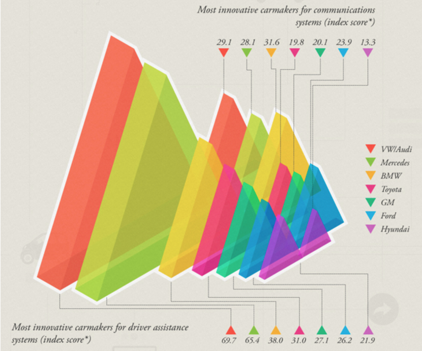
UNJUSTIFIED USE OF 3D
Common in news and some infographics.

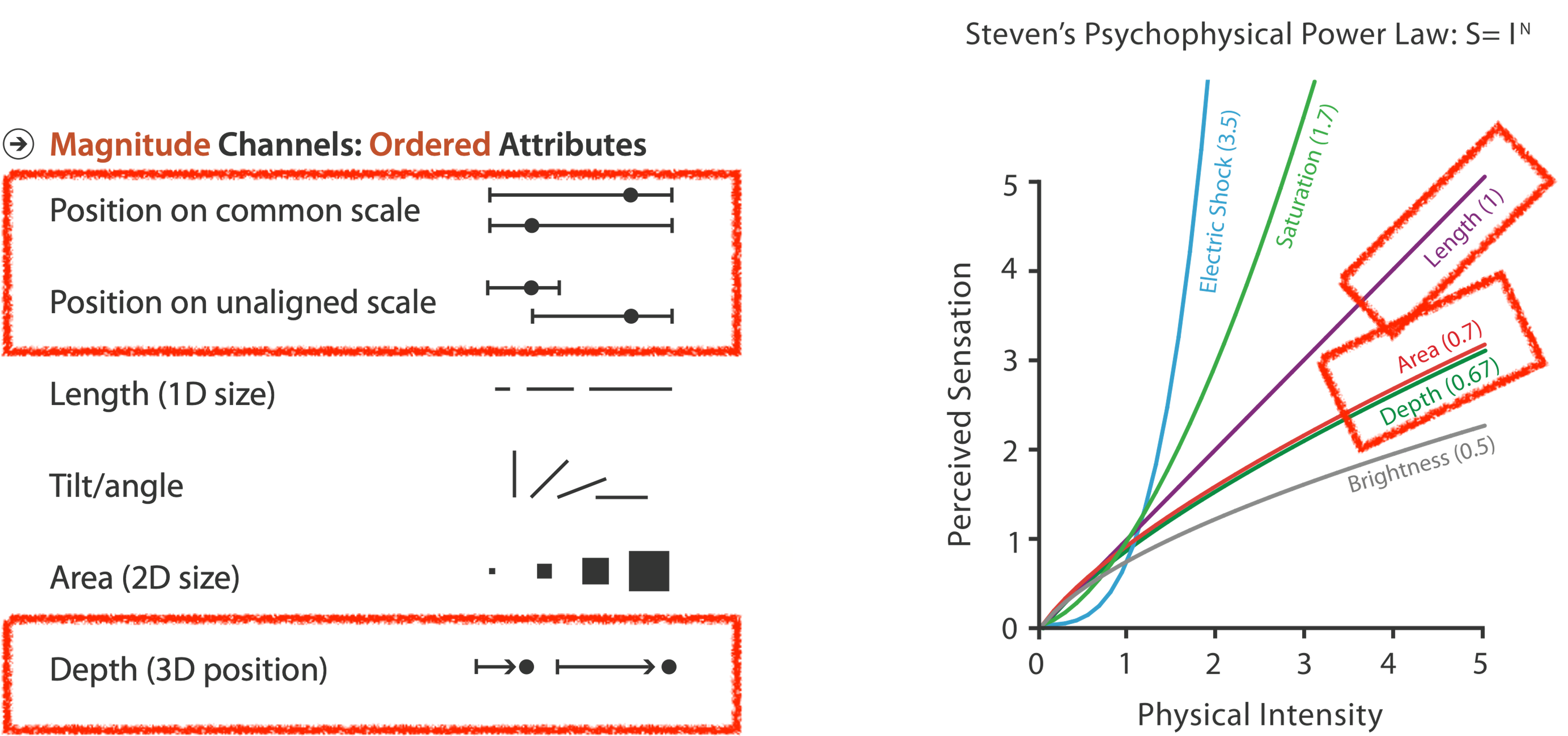
DEPTH VS PLANAR POSITION
Position channels are very powerful… when they are PLANAR SPATIAL POSITION, not depth!
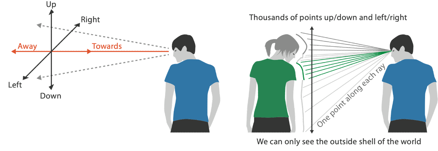
THE DANGERS OF DEPTH

THE ACTUAL DANGERS OF DEPTH
We don’t really live in 3D: we see in 2.05D.
- We acquire more info on an image plane quickly using eye movements
- We acquire more info for depth much more slowly using head/body motion
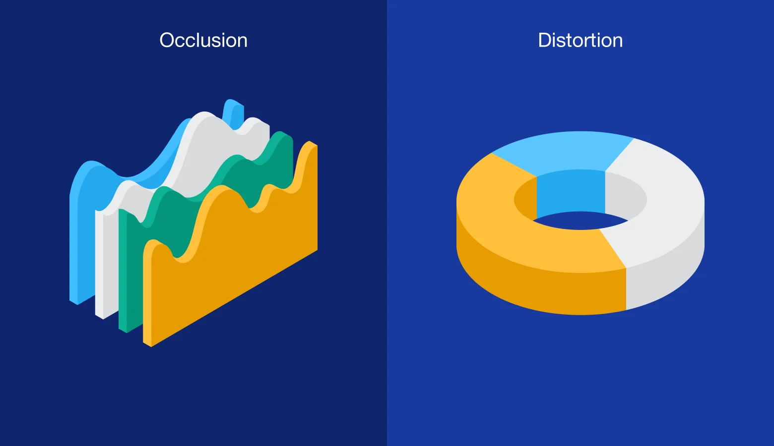
OCCLUSION
“Occlusion occurs when one 3D graphic partially blocks another. It is the result of mimicking space in the natural world–where objects have differing X, Y, and Z coordinates. In data visualization, occlusion obscures important data and creates false hierarchies wherein unobstructed graphics appear most important.” … From This BLOG post by M. Bowers.
Interaction can resolve occlusion, but at cost of time and cognitive load.
PERSPECTIVE DISTORTION
Perspective in 3D visualizations interferes with all size channel encodings. The power of 2D planar positioning is lost!
“Distortion occurs when 3D graphics recede into or project out from the picture plane through foreshortening. In drawing, foreshortening makes objects seem as though they inhabit three-dimensional space, but in data visualization, it creates more false hierarchies. Foreground graphics appear larger, background graphics smaller, and the relationship between data series is needlessly skewed.”…… From This BLOG post by M. Bowers.
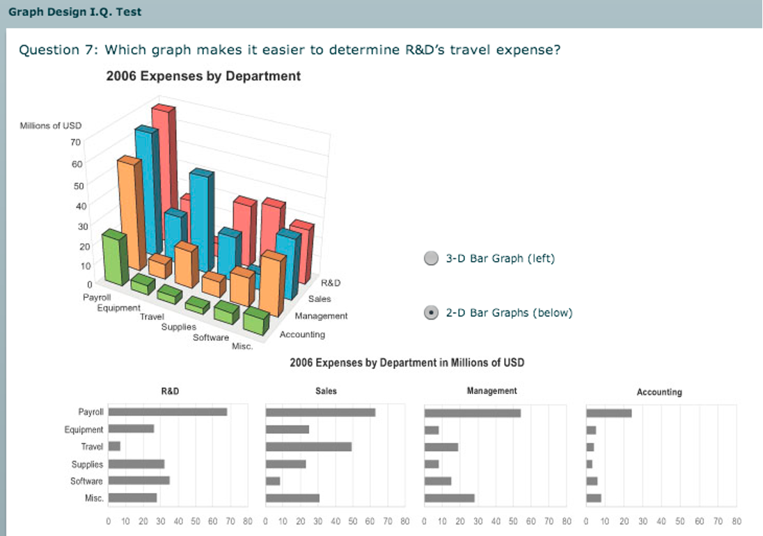
3D BAR CHARTS - Probably not…
3D bars are very difficult to justify!
Perspective distortion and occlusion make faceting into 2D the better choice in most situations.
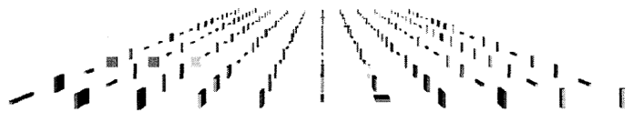
TILTED TEXT
Skewed perspective in 3D visualizations does not interact well with fonts.
Exploring and Reducing the Effects of Orientation on Text Readability in Volumetric Displays.Grossman et al. CHI 2007
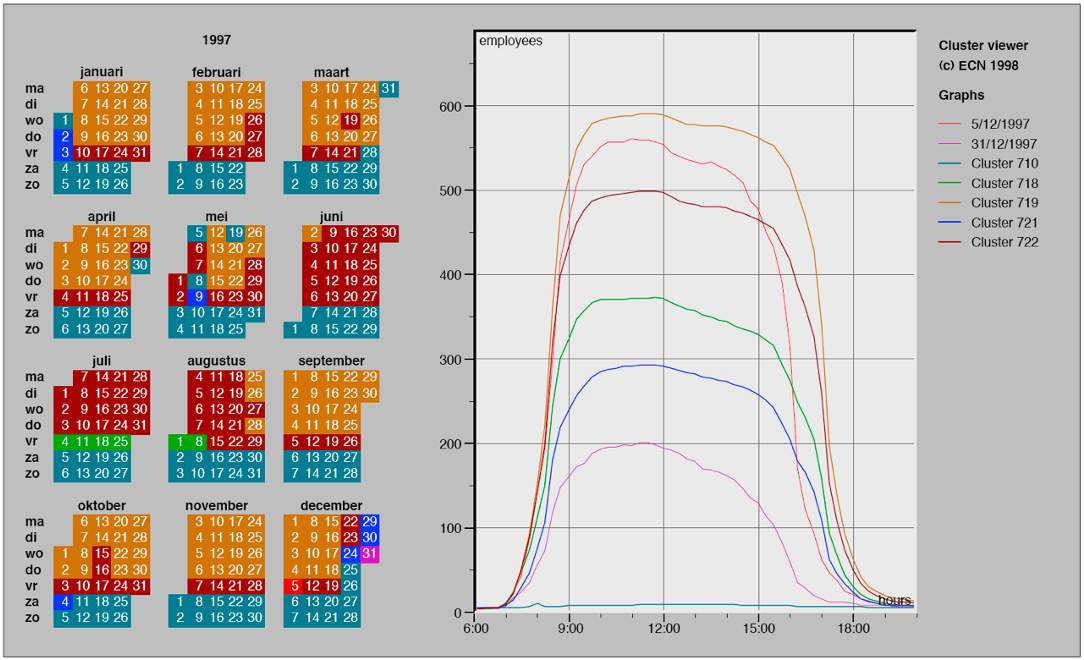
EXAMPLE: 3D EXTRUDED TIME SERIES
What information can we decode from this visualization?
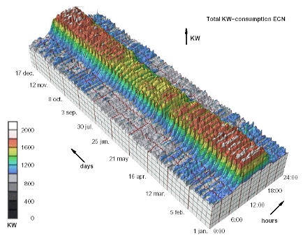
Cluster and Calendar based Visualization of Time Series Data. van Wijk and van Selow, Proc. InfoVis 99.
PLANAR ALTERNATIVE
This version of the extruded time series visualization uses derived data by computing a cluster hierarchy of power usage patterns. It then juxtaposes multiple views: a calendar and superimposed 2D curves differentiated with a color channel.
3D: SHAPE PERCEPTION
The benefits of 3D visualization outweigh its costs when the task is shape perception for 3D spatial data. Interactive navigation often supports synthesis across many viewpoints.
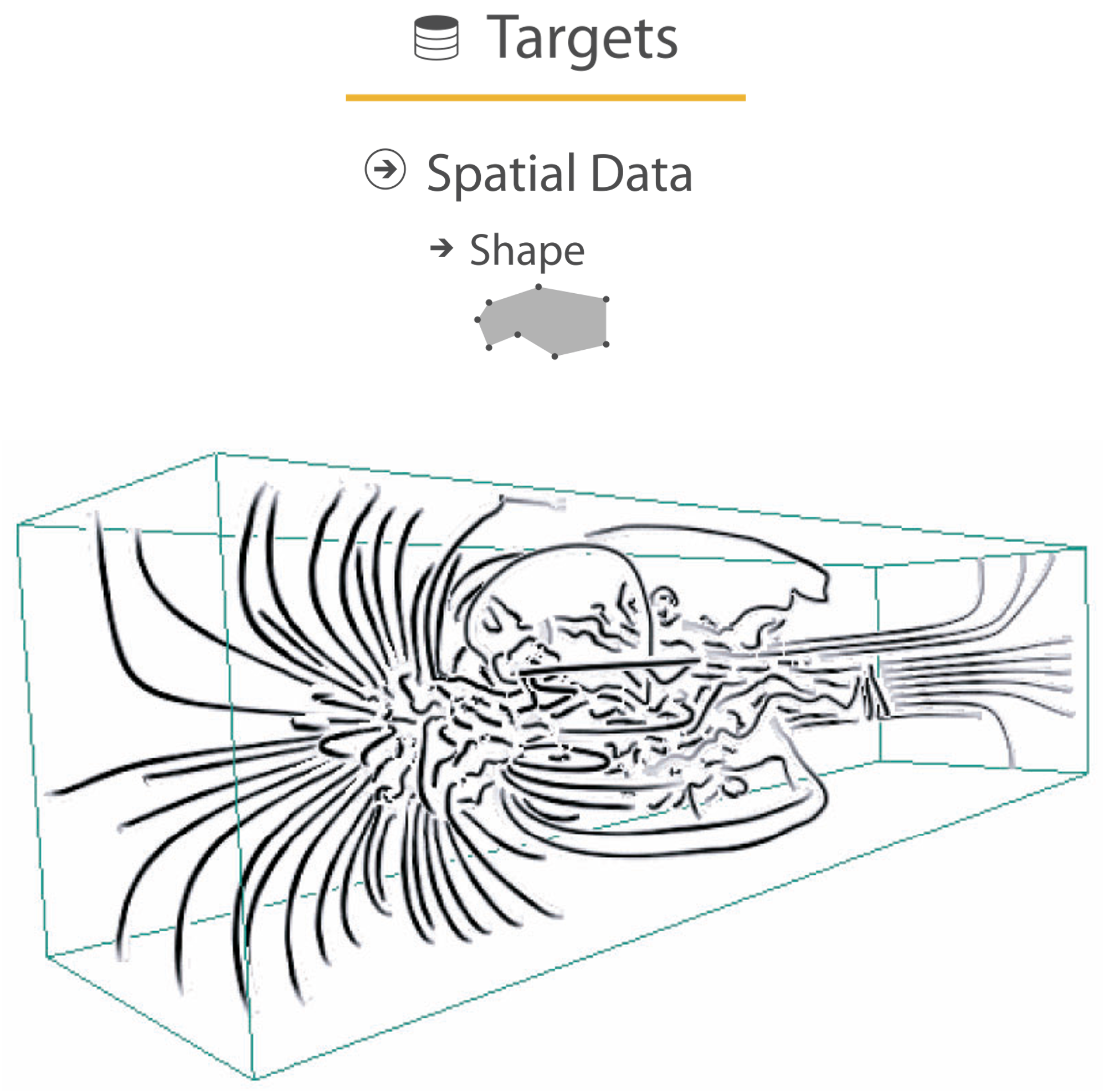
Image-Based Streamline Generation and Rendering. Li and Shen. IEEE Trans. Visualization and Computer Graphics (TVCG) 13:3 (2007), 630–640.
3D: CONSTRAINED NAVIGATION
RESOLUTION BEATS IMMERSION
Immersion is typically not helpful for abstract data because we do not need a sense of presence or stereoscopic 3D. A desktop view is also usually better for workflow integration.
Resolution in VR is a critical constraint, as pixels are the scarcest resource.
First wave: virtual reality for abstract data! This is difficult to justify.
Second wave: AR/MR (augmented/mixed reality) has more promise.

OVERVIEW
“Overview first, zoom and filter, details on demand”
The Eyes Have It: A Task by Data Type Taxonomy for Information Visualizations. Shneiderman. Proc. IEEE Visual Languages, pp. 336–343, 1996.
This seems simple enough, until you realize that “Overview” is really a microcosm of the full vis design problem space.
BREAKING CONVENTIONS
The inverted y axis is evocative of blood dripping down on Poe. Also, this is a cool example of “Overview first, zoom and filter, details on demand”
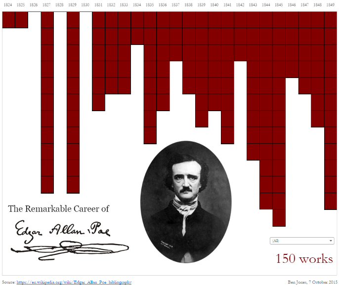
https://public.tableau.com/profile/ben.jones#!/vizhome/EdgarAllanPoeViz/EdgarAllanPoeViz
FORM: BASIC GRAPHIC DESIGN
Proximity:
DO group related items together
AVOID equal whitespace between unrelated items
Alignment:
DO find/make a strong line and stick to it
AVOID automatic centering
Repetition:
DO unify by pushing existing consistencies
Contrast:
If not identical, then very different
AVOID not quite the same
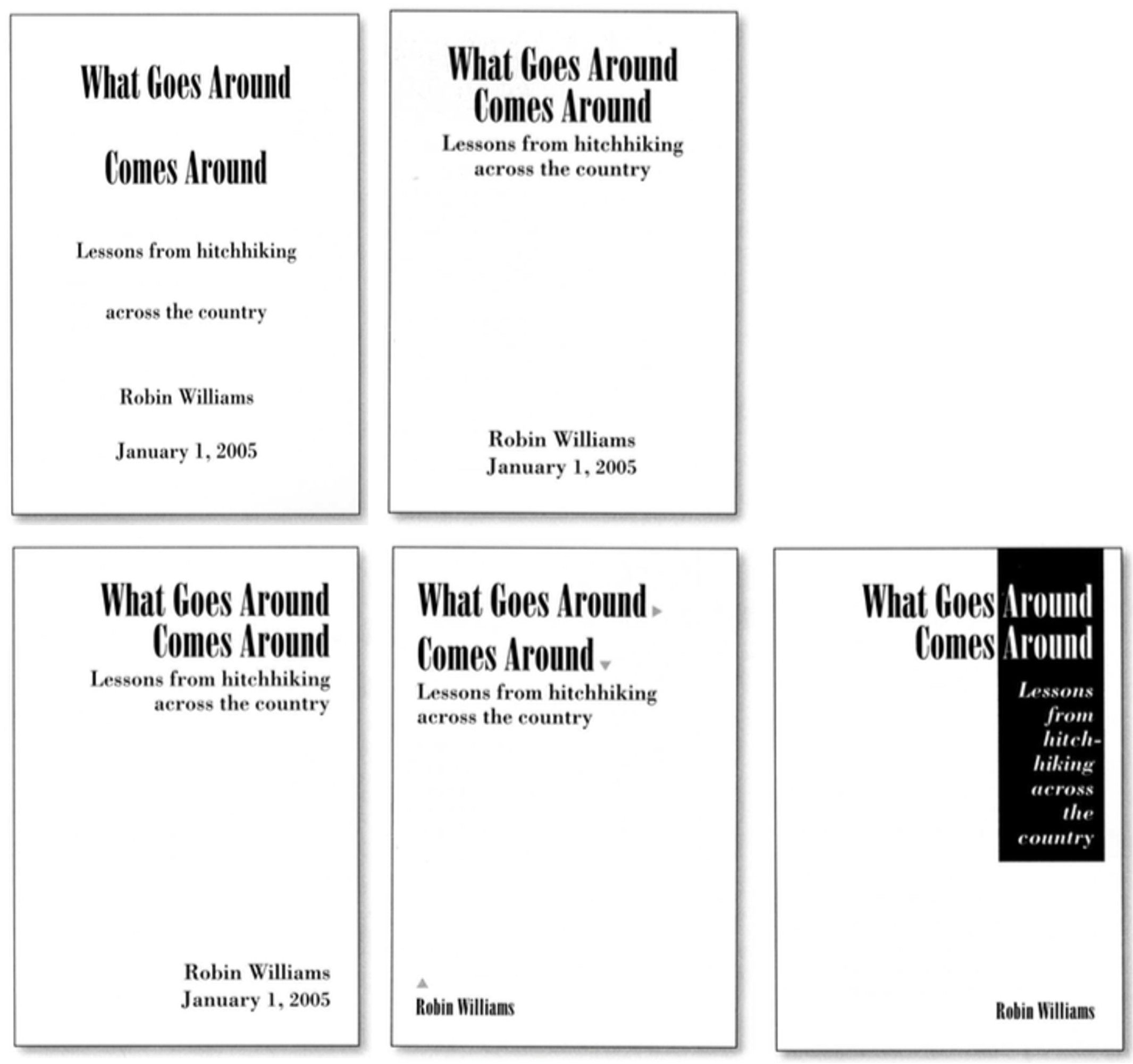
The Non-Designer’s Design Book, 4th ed. Robin Williams, Peachpit Press, 2015. fast read, very practical to work through whole thing
LABELLING
Make visualizations as self-documenting as possible!
Meaningful & useful title, labels, legends.
Axes and panes/subwindows should have labels and axes should have good mix/max boundary tick marks.
Everything that’s plotted should have a legend and its own header/labels if not redundant with main title.
Use reasonable numerical format and avoid scientific notation in most cases.
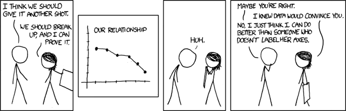
https://xkcd.com/833/
SUMMARY - RULES OF THUMB
- No unjustified 3D
- Power of the plane
- Disparity of depth
- Occlusion hides information
- Perspective distortion dangers
- Tilted text isn’t legible
- Eyes beat memory
- Resolution over immersion
- Overview first, zoom and filter, details on demand
- Responsiveness is required
- Function first, form next