Code
library(tidyverse)
library(lubridate)
library(readxl)library(tidyverse)
library(lubridate)
library(readxl)ZOMBIES.
Zombies have long been a frequent trope of horror fiction. The concept of zombies first emerged from Haitian folklore and Voodoo, where they were depicted as reanimated corpses that were controlled by a sorcerer or bokor. However, in modern fiction, the magical or supernatural origin of zombies has been largely replaced by a scientific one. Zombies are now typically portrayed as mindless, flesh-eating creatures that are reanimated by a virus or some other infectious agent.
The evolution of zombies as a horror trope can be divided into several distinct eras:
Classic Zombies: The classic zombie was the original Haitian zombie, which was introduced to Western audiences in the early 20th century through literature and film. These zombies were depicted as slow-moving, mind-controlled creatures that were raised from the dead by Voodoo magic.
Romero Zombies: George A. Romero’s 1968 film “Night of the Living Dead” redefined the zombie genre by introducing the idea that zombies were reanimated by a mysterious virus that spread through bites and scratches. Romero’s zombies were slow-moving, flesh-eating creatures that could only be killed by destroying the brain. Many modern zombie franchises (e.g. Resident Evi, Walking Dead) still use the classic shambling undead Romeero Zombie concept.
Fast Zombies: In the early 2000s, a new type of zombie emerged in fiction that could run and move at incredible speeds. These fast zombies were popularized by films like 28 Days Later and World War Z. Fast zombies are often depicted as being more aggressive and intelligent than their slow-moving counterparts. Note that in many of these zombie franchises, the zombies were still created by an infectious agent such as a virus.
Post-Apocalyptic Zombies: In recent years, zombies have been featured in a number of post-apocalyptic settings, where they are often portrayed as the cause of a global pandemic that has devastated humanity. These stories often focus on the struggle of survivors to rebuild civilization in a world overrun by the undead. These can be any of the above types (Classic, Romero, Fast) of zombie. This is the scenario that motivates this Blog post.
Would an outbreak of a “zombie virus” actually consume the world and bring forth an apocalyptic new age of shambling horror?
Let’s use disease modeling to find out!
I’m going to use our new interactive simulation, OUTBREAK SIMULATOR, to understand the dynamics of a zombie virus outbreak.
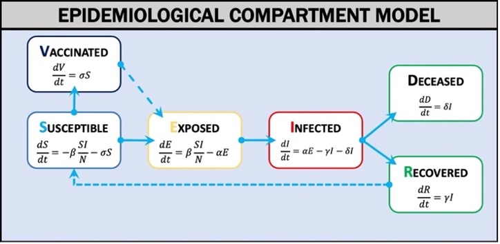
In order to model this outbreak, we’ll need to set some of the classic parameters of an SIR compartment model. Outbreak Simulator uses a compartment model of disease (Weissman et al., 2020) in which the population is divided into categories (Figure 1): Susceptible (S), Exposed (E), Infected (I), Vaccinated (V), Recovered (R), or Deceased (D). The model estimates the rates of exchange between categories over a given time interval (t) using differential equations. When the model parameters are known and key assumptions are met, the differential equations can estimate the epidemic curve of an outbreak. The two most critical assumptions are that the population is homogeneous and well mixed and is fixed in size.
I’ve provided my own estimates of these parameters for various infectious zombie franchises in the table below.
params<-read_xlsx("params.xlsx")

knitr::kable(params)| Parameter | Definition | Resident Evil | World War Z | Walking Dead |
|---|---|---|---|---|
| BETA | Rate of transmission | 19.8 | 198 | 20 |
| contact rate | Number of infectious contacts (bites) per hour | 20 | 200 | 20 |
| infection probability | Chance that a bite causes infection | 0.99 | 0.99 | 1 |
| ALPHA | Transformation rate | 0.5 | 1000 | 2.0833333333333332E-2 |
| latency | average number of hours until transformation to Infected | 2 | 1E-3 | 48 |
| GAMMA | Recovery rate | 0 | 0 | 0 |
| DELTA | Mortality rate | 1 | 1 | 1 |
| infection duration | average lifespan of a zombie in hours | 250 | 250 | 250 |
| SIGMA | Vaccination rate | 0 | 0 | 0 |
| R0 Initial | Initial basic reproduction rate of the virus | 4950 | 49500 | 5000 |
| Speed | How fast can the zombies move? | Slow | Fast | Slow |
Outbreak Simulator runs the compartment model on a spatially explicit grid of the continental US. It writes the number of individuals in each compartment (SIERD) at each time step (an hour) for each of the 48 states and the total population.
This is a video of the simulation:
df<-read.csv("ZombieData.csv")I’ll manipulate the raw data a bit to get to the visualizations I need. First, I want a tidy data set with only the total US population.
df<-df%>%
  mutate_at(c(1:295), as.numeric)

dftotal <- df%>%
  select(Time, starts_with("Totals_"))%>%
  rename(Time=Time,
          S=Totals_S,
         E=Totals_E,
         V=Totals_V,
         I=Totals_I,
         R=Totals_R,
         D=Totals_D)

for (i in 1:length(dftotal$Time)){

  dftotal$dS[i] <- dftotal$S[i]-dftotal$S[i+1]
  dftotal$dR[i] <- dftotal$R[i+1]-dftotal$R[i]
  dftotal$dI[i] <- dftotal$I[i+1]-dftotal$I[i]
  dftotal$dD[i] <- dftotal$D[i+1]-dftotal$D[i]

}

dftotal<- dftotal%>%
  mutate(N= S+E+I+V+R+D)%>%
  mutate(Beta = dS*N/(S*I+1))%>%
  mutate(Gamma = dD/(I+1))%>%
  mutate(R0 = Beta/Gamma)%>%
  filter(Beta<10)%>%
  filter(R0<10^3)

dflong<-dftotal%>%
  pivot_longer(cols = c("S", "E", "I",
                        "V", "R", "D"),names_to = "Compartment", values_to = "Count")

dflong <- dflong%>%
  mutate(Compartment = recode(Compartment,
         S = "Susceptible",
         E = "Exposed",
         I = "Infected",
         V = "Vaccinated",
         R = "Recovered",
         D = "Deceased"))%>%
  filter(Compartment != "Vaccinated")%>%
  filter(Compartment != "Recovered")
This allows me to produce the classic Epidemilogical Curve:
ggplot(dflong, aes(x=Time, y = Count/10^6, color = Compartment))+
  geom_line()+
   labs(
    title = "Epidemiological Curve",
    subtitle = "Resident Evil - T Virus",
    caption = "Data from a single run of Outbreak Simulator.",
    tag = "Figure 1",
    x = "Time (h)",
    y = "Number of Individuals (millions)",
    colour = "Compartment"
  )+
   scale_colour_brewer(type = "seq", palette = "Spectral")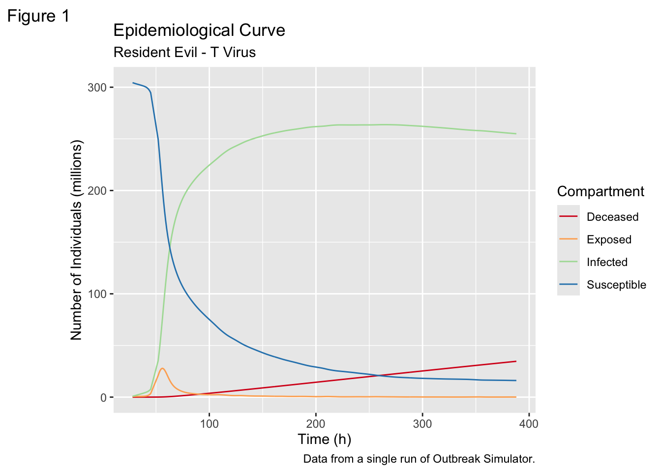
We can use the output from the simulation to show the Epidemilogical Curve for each state, but the problem is the number of states. There are 48 in the continental US - too many to ask a user to meaningfully process.
Here are the curves for four states - the ones that collaborate on the Tickbase project that funds this work.
stateslong <- df %>%
  pivot_longer(cols = 2:295,
               names_to = c("State", "Compartment"),
  names_pattern = "(.+?)_(.)",
  values_to = "Count")

fewerstates<-stateslong%>%
  filter(State == "New.Mexico" | State == "Idaho"
         | State =="Nevada" | State == "New.Hampshire"
         )%>%
    mutate(Compartment = recode(Compartment,
         S = "Susceptible",
         E = "Exposed",
         I = "Infected",
         V = "Vaccinated",
         R = "Recovered",
         D = "Deceased"))%>%
  filter(Compartment != "Vaccinated")%>%
  filter(Compartment != "Recovered")


ggplot(fewerstates, aes(x=Time, y = Count/10^6, color = Compartment))+
  geom_line()+
  facet_wrap(~State)+
   labs(
    title = "Epidemiological Curve",
    subtitle = "H1N1 Influenza",
    caption = "Data from a single run of Outbreak Simulator.",
    tag = "Figure 2",
    x = "Time (h)",
    y = "Number of Individuals (millions)",
    colour = "Compartment"
  )+
   scale_colour_brewer(type = "seq", palette = "Spectral")
statecolor<-stateslong%>%
  filter(Compartment == "S" & State != "Totals" & Time == 0)%>%
  mutate(rank = rank(Count))

stateslong2 <- left_join(stateslong, statecolor, by = c("State",
                                                        "Compartment"))

Zomstates <- stateslong2 %>%
  filter(Compartment == "S" & State != "Totals")%>%
  mutate(date = as_date(Time.x),
         name = State,
         category = rank,
         value = Count.x)%>%
  select(c(8:11))


write.csv(Zomstates, "Zomstates.csv")I’m really interested in an animated visualization that captures the changing population dynamics in each state. I’m going to use Observable for this, modifying an existing workbook.
data = d3.csvParse(await FileAttachment("Zomstates.csv").text(), d3.autoType)

viewof replay = html`<button>Replay`chart = {
replay;
const svg = d3.create("svg")
.attr("viewBox", [0, 0, width, height]);
const updateBars = bars(svg);
const updateAxis = axis(svg);
const updateLabels = labels(svg);
const updateTicker = ticker(svg);
yield svg.node();
for (const keyframe of keyframes) {
const transition = svg.transition()
.duration(duration)
.ease(d3.easeLinear);
// Extract the top bar’s value.
x.domain([0, keyframe[1][0].value]);
updateAxis(keyframe, transition);
updateBars(keyframe, transition);
updateLabels(keyframe, transition);
updateTicker(keyframe, transition);
invalidation.then(() => svg.interrupt());
await transition.end();
}
}
duration = 25
n = 50
k = 10
names = new Set(data.map(d => d.name))
datevalues = Array.from(d3.rollup(data, ([d]) => d.value, d => +d.date, d => d.name))
.map(([date, data]) => [new Date(date), data])
.sort(([a], [b]) => d3.ascending(a, b))
function rank(value) {
const data = Array.from(names, name => ({name, value: value(name)}));
data.sort((a, b) => d3.descending(a.value, b.value));
for (let i = 0; i < data.length; ++i) data[i].rank = Math.min(n, i);
return data;
}
keyframes = {
const keyframes = [];
let ka, a, kb, b;
for ([[ka, a], [kb, b]] of d3.pairs(datevalues)) {
for (let i = 0; i < k; ++i) {
const t = i / k;
keyframes.push([
new Date(ka * (1 - t) + kb * t),
rank(name => (a.get(name) || 0) * (1 - t) + (b.get(name) || 0) * t)
]);
}
}
keyframes.push([new Date(kb), rank(name => b.get(name) || 0)]);
return keyframes;
}
nameframes = d3.groups(keyframes.flatMap(([, data]) => data), d => d.name)
prev = new Map(nameframes.flatMap(([, data]) => d3.pairs(data, (a, b) => [b, a])))
next = new Map(nameframes.flatMap(([, data]) => d3.pairs(data)))
function bars(svg) {
let bar = svg.append("g")
.attr("fill-opacity", 0.6)
.selectAll("rect");
return ([date, data], transition) => bar = bar
.data(data.slice(0, n), d => d.name)
.join(
enter => enter.append("rect")
.attr("fill", color)
.attr("height", y.bandwidth())
.attr("x", x(0))
.attr("y", d => y((prev.get(d) || d).rank))
.attr("width", d => x((prev.get(d) || d).value) - x(0)),
update => update,
exit => exit.transition(transition).remove()
.attr("y", d => y((next.get(d) || d).rank))
.attr("width", d => x((next.get(d) || d).value) - x(0))
)
.call(bar => bar.transition(transition)
.attr("y", d => y(d.rank))
.attr("width", d => x(d.value) - x(0)));
}
function labels(svg) {
let label = svg.append("g")
.style("font", "bold 12px var(--sans-serif)")
.style("font-variant-numeric", "tabular-nums")
.attr("text-anchor", "end")
.selectAll("text");
return ([date, data], transition) => label = label
.data(data.slice(0, n), d => d.name)
.join(
enter => enter.append("text")
.attr("transform", d => `translate(${x((prev.get(d) || d).value)},${y((prev.get(d) || d).rank)})`)
.attr("y", y.bandwidth() / 2)
.attr("x", -6)
.attr("dy", "-0.25em")
.text(d => d.name)
.call(text => text.append("tspan")
.attr("fill-opacity", 0.7)
.attr("font-weight", "normal")
.attr("x", -6)
.attr("dy", "1.15em")),
update => update,
exit => exit.transition(transition).remove()
.attr("transform", d => `translate(${x((next.get(d) || d).value)},${y((next.get(d) || d).rank)})`)
.call(g => g.select("tspan").tween("text", d => textTween(d.value, (next.get(d) || d).value)))
)
.call(bar => bar.transition(transition)
.attr("transform", d => `translate(${x(d.value)},${y(d.rank)})`)
.call(g => g.select("tspan").tween("text", d => textTween((prev.get(d) || d).value, d.value))))
}
function textTween(a, b) {
const i = d3.interpolateNumber(a, b);
return function(t) {
this.textContent = formatNumber(i(t));
};
}
formatNumber = d3.format(",d")
function axis(svg) {
const g = svg.append("g")
.attr("transform", `translate(0,${margin.top})`);
const axis = d3.axisTop(x)
.ticks(width / 160)
.tickSizeOuter(0)
.tickSizeInner(-barSize * (n + y.padding()));
return (_, transition) => {
g.transition(transition).call(axis);
g.select(".tick:first-of-type text").remove();
g.selectAll(".tick:not(:first-of-type) line").attr("stroke", "white");
g.select(".domain").remove();
};
}
function ticker(svg) {
const now = svg.append("text")
.style("font", `bold ${barSize}px var(--sans-serif)`)
.style("font-variant-numeric", "tabular-nums")
.attr("text-anchor", "end")
.attr("x", width - 6)
.attr("y", margin.top + barSize * (n - 0.45))
.attr("dy", "0.32em")
.text(formatDate(keyframes[0][0]));
return ([date], transition) => {
transition.end().then(() => now.text(formatDate(date)));
};
}
formatDate = d3.utcFormat("%Y")
color = {
const scale = d3.scaleSequential(d3.interpolate("red", "blue")).domain([1, 48]);
if (data.some(d => d.category !== undefined)) {
const categoryByName = new Map(data.map(d => [d.name, d.category]))
scale.domain(Array.from(categoryByName.values()));
return d => scale(categoryByName.get(d.name));
}
return d => scale(d.name);
}
<!-- color = { -->
<!-- const scale = d3.scaleSequential(d3.interpolate("red", "blue")).domain([1, 48]); -->
<!-- if (data.some(d => d.category !== undefined)) { -->
<!-- const categoryByName = new Map(data.map(d => [d.name, d.category])); -->
<!-- const categories = Array.from(categoryByName.values()).filter((d, i, arr) => arr.indexOf(d) === i); -->
<!-- const scaleByCategory = typeof categories[0] === "number" ? -->
<!-- d3.scaleSequential(d3.interpolateSpectral).domain(d3.extent(categories)) : -->
<!-- d3.scaleOrdinal().domain(categories).range(d3.quantize(d3.interpolateSpectral, categories.length)); -->
<!-- return d => scale(scaleByCategory(categoryByName.get(d.name))); -->
<!-- } -->
<!-- return (d, i) => scale(i); -->
<!-- } -->
x = d3.scaleLinear([0, 1], [margin.left, width - margin.right])
y = d3.scaleBand()
.domain(d3.range(n + 1))
.rangeRound([margin.top, margin.top + barSize * (n + 1 + 0.1)])
.padding(0.1)
height = margin.top + barSize * n + margin.bottom
barSize = 48
margin = ({top: 16, right: 6, bottom: 6, left: 0})
d3 = require("d3@6")It is pretty clear from the simulations that an outbreak of the T-Virus is really bad news for the continental United States. We go from ~308 million people to ~10 million people in about 500 hours. In addition, the most populated states at the beginning of the outbreak are hit disproportionately hard, presumably because their population density helps sustain the infection.
library(ggplot2)
library(sf)
Linking to GEOS 3.13.0, GDAL 3.8.5, PROJ 9.5.1; sf_use_s2() is TRUElibrary(tigris)To enable caching of data, set `options(tigris_use_cache = TRUE)`
in your R script or .Rprofile.library(dplyr)us_counties <- tigris::counties(cb = TRUE, resolution = "20m", year = 2020, class = "sf")
  |
  |                                                                      |   0%
  |
  |=                                                                     |   2%
  |
  |===                                                                   |   4%
  |
  |====                                                                  |   6%
  |
  |=====                                                                 |   7%
  |
  |======                                                                |   9%
  |
  |========                                                              |  11%
  |
  |=========                                                             |  13%
  |
  |==========                                                            |  15%
  |
  |============                                                          |  17%
  |
  |=============                                                         |  18%
  |
  |==============                                                        |  20%
  |
  |===============                                                       |  22%
  |
  |=================                                                     |  24%
  |
  |==================                                                    |  26%
  |
  |===================                                                   |  28%
  |
  |====================                                                  |  29%
  |
  |======================                                                |  31%
  |
  |=======================                                               |  33%
  |
  |========================                                              |  34%
  |
  |=========================                                             |  36%
  |
  |===========================                                           |  38%
  |
  |============================                                          |  40%
  |
  |=============================                                         |  42%
  |
  |===============================                                       |  44%
  |
  |================================                                      |  45%
  |
  |=================================                                     |  47%
  |
  |==================================                                    |  49%
  |
  |====================================                                  |  51%
  |
  |=====================================                                 |  53%
  |
  |======================================                                |  55%
  |
  |========================================                              |  57%
  |
  |=========================================                             |  58%
  |
  |==========================================                            |  60%
  |
  |===========================================                           |  62%
  |
  |=============================================                         |  64%
  |
  |==============================================                        |  66%
  |
  |===============================================                       |  67%
  |
  |================================================                      |  69%
  |
  |==================================================                    |  71%
  |
  |===================================================                   |  73%
  |
  |====================================================                  |  75%
  |
  |======================================================                |  77%
  |
  |=======================================================               |  78%
  |
  |========================================================              |  80%
  |
  |=========================================================             |  82%
  |
  |===========================================================           |  84%
  |
  |============================================================          |  86%
  |
  |=============================================================         |  87%
  |
  |==============================================================        |  89%
  |
  |================================================================      |  91%
  |
  |=================================================================     |  93%
  |
  |==================================================================    |  95%
  |
  |====================================================================  |  97%
  |
  |===================================================================== |  98%
  |
|======================================================================| 100%set.seed(123)
data <- data.frame(
GEOID = us_counties$GEOID,
value = runif(length(us_counties$GEOID), 0, 100)
)
us_counties_data <- left_join(us_counties, data, by = "GEOID")
ggplot() +
geom_sf(data = us_counties_data, aes(fill = value), color = "white", size = 0.1) +
scale_fill_viridis_c() + # You can choose other color palettes
theme_minimal() +
theme(axis.text = element_blank(),
axis.title = element_blank(),
axis.ticks = element_blank(),
panel.grid = element_blank())
us_counties_contiguous <- us_counties %>%
  filter(
    !(STATEFP %in% c("02", "15", "60", "66", "69", "72", "78"))
  )

us_counties_data_contiguous <- left_join(us_counties_contiguous, data, by = "GEOID")


ggplot() +
  geom_sf(data = us_counties_data_contiguous, aes(fill = value), color = "white", size = 0.1) +
  scale_fill_viridis_c() +
  theme_minimal() +
  theme(axis.text = element_blank(),
        axis.title = element_blank(),
        axis.ticks = element_blank(),
        panel.grid = element_blank())